Tuesday, November 3, 2009

Kids Bedroom + Kids Study Room Ideas from Sergi


Create an exciting room for study and bedroom to take a rest for your kids by using this nice inspiring ideas of kids bedroom and study room layout from Sergi. There are great photo realistic render image of Kids bedroom and study room from the designer with great color scheme combination, excellent kids furniture choice and different kids rooms themes. Try to pick out best one for your kids room interior decoration and change your common kids room space themes to an exciting one from the Sergi.


Based on what the needs are for the interior design of a children’s bedroom, an interior designer will use modeling programs and concept sketches to get an idea of how to put the room together. The interior design of a bedroom may include selecting furniture that will support the functions of the bedroom, such as beds and desks, as well as the appearance of the room, including paint and window treatments.


Ayres Retail Store by Dieguez Fridman


A cool Ayres Retail Store located in El Solar de la Abada Mall, Buenos Aires, Argentina. This new retail store was designed by Dieguez Fridman architects. The unfolded idea wraps around the store draws the attention from the visitors, that creating a sense of welcoming to the store. The geometry itself expresses the sensuality and amutating infatuation with each perspective changes.


From the architects :

Through a faceted form that unfolds in the store, the project explores the ambiguity between object and container. The form defines itself through its’ contrast of textures, colors and geometry with the container. By approaching it and blending with it at the certain points, and separating from it at others, the space for clothes display and fitting rooms is generated.


Architect: Dieguez Fridman arquitectos & asociados
Project: Ayres Store, El Solar de la Abada Mall
Location: Buenos Aires, Argentina
Images © Dieguez Fridman arquitectos & asociados


Sunday, June 21, 2009

The Book Porcupine by Holly Palmer

The Book Porcupine by Holly Palmer

British designer Holly Palmer has designed the Book Porcupine for your favourite bookshelf storage solution.

With 18 compartments in various sizes for storing your favourite books, the Book Porcupine is a product that is based on the idea of negative spaces. The compartments are the books negative representations made permanent in the structure of the unit. Designed to sit beside a standard chair, the name of the piece is given in reference to its silhouette – the short, stout legs against the books sticking out at various angles and degrees. Good for flats or smaller homes as an alternative book shelf.

Visit Holly Palmer’s website - here.

The Book Porcupine by Holly Palmer

Harbour Isle Apartments by Lundgaard & Tranberg

Harbour Isle Apartments by Lundgaard & Tranberg

Designed by The Danish architects Lundgaard & Tranberg. The residential project of Harbour Isle apartment occupies a unique location on a harbour island in a former industrial area, close to both park areas and the centre of Copenhagen. To make best of the exceptional location, the project is divided into smaller building volumes, relating to views, solar exposure, and harbour.

Harbour Isle Apartments by Lundgaard & Tranberg

In addition to providing unobstructed view sight lines for each unit, the design creates a variation in apartment types and the corresponding balconies. Staggered projecting bays with corner windows provide panoramas of harbour and city, while also screening views from neighbours, insuring the privacy of each apartment.

Harbour Isle Apartments by Lundgaard & Tranberg

The project consists of 236 exclusive apartments with an average area of 101 m2/1.087 ft2, consisting primarily of two and three bedroom apartments, a small portion of which are two levels. The entire project, including the projecting bays, is rendered in warm white stucco, while the fenestration has teak profiles.


Harbour Isle Apartments by Lundgaard & Tranberg

Saturday, April 11, 2009

Master Bathroom Renovation in Ranch Style Home by Bryan Boyer

Master Bathroom Renovation

This Master Bathroom Renovation Project was designed by Bryan Boyer, located San Luis Obispo County CA with 215 square feet area, this bathroom renovation project in Ranch Style Home was completed in 2009.

Master Bathroom Renovation

Located amongst 5000 walnut trees dotting a farm in California's rural Central Coast, this master bathroom renovation is conceptualized as the literal, concentrated heart of the orchard. Here, walnut and stone — crop and soil — are played off of each other as two wrapping surfaces that form the interior space of the bathroom.


A floor of natural black slate folds up to create a walk-in shower which then gives way to a curving wall of book-matched Walnut veneer to form the toilet room, closet, and a seating nook. At the center of the room stands a solid walnut island. The basin itself is milled from the wood to form the sink. A large storage area opens like a car-hood to reveal easy access to daily hygiene items while hiding the clutter when not in use.

Master Bathroom Renovation

Master Bathroom Renovation

link

Carapicuiba House by Angelo Bucci and Alvaro Puntoni

Carapicuiba House

Carapicuiba House is located in topographical terms Carapicuíba, SP, Brazil and was designed by Angelo Bucci, Alvaro Puntoni. From the street, we cannot clearly see its ground level because the ground surface falls abruptly into a little valley and woods: a stage 6 m below. The program joins two different purposes: a house and an office, it is a place to both live and work. Although these two functions share the same space, it is as separate as possible.


The different levels offered by the site were utilized to arrange the two main programs. The street level was kept free of any enclosed space, it is a kind of “pilotis” with two different areas: the first one is on the ground, very close to the street, and the other one is aerial, as a roof terrace over the building. A bridge, made of steel, connects these two areas. The only entrance to the building is the bridge with its steel grid floor that leads over the open space: downstairs to the house or upstairs to the office.

Carapicuiba House Brazil


The Carapicuiba house is divided into two levels, both below the street level. Its spaces are integrated with the woods, valley, gardens, and pool located at the ground level. The Carapicuiba house incorporates the outside nature indoors: a sliding glass door opens the living room into the terrace,creating one large space.

Carapicuiba House Brazil

The bedroom and the patios can also be integrated at the lower level. From the street level, the office is located upstairs. Its dimensions, 3 m wide and 25 m long, making it look like a tube open at both extremities.

Carapicuiba House Brazil

Therefore, the windows offer new views: more landscape than patios, and more panoramic than an intimate space. The “tube” only rests over two columns. Reinforced concrete supports the whole building. Besides its materials, concrete and glass, this carapicuiba house is essentially designed based on the site’s geography and landscape. So few elements mean more concentration on the required work during its construction process. It makes it easier to control the budget and it help us focus on the necessary steps to build the carapicuiba house.

Carapicuiba House Brazil

Frame Bar Design Athens by Dimitris Tsigos

Frame Bar Design Athens by Dimitris Tsigos

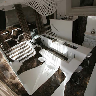
An interesting Frame Bar Interior Design created by architects Dimitris Tsigos. Frame Bar is the main bar of the st George lycabettus hotel, located in kolonaki, Athens. The main goal of the Frame Bar Interior Design was to recreate the usual typologies of chairs, benches, bars stands, tables and coffee tables using forms that morph from one geometry to the other, thus denying determined typology – activity associations.

Frame Bar Design

This was achieved by using advanced parametric design techniques which led to the specification of a series of poly – surfaces, ultimately constructed out of thermo – formed staron. The geometrical continuity is retained throughout the design, ultimately offering a continuous interior topography that assumes different geometrical specifications in relation to specific programmatic intentions. The main materials used are heat-formed starron (corrian equivalent) and the Spanish marble known as emperador.

Frame Bar Design Athens by Dimitris Tsigos


Related News: Frame Bar Athens by Dimitris Tsigos